Typography
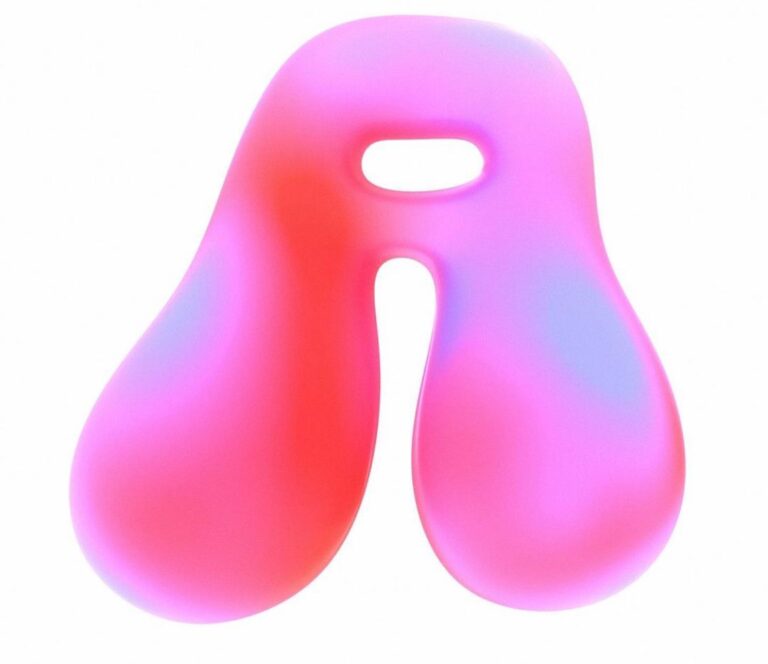
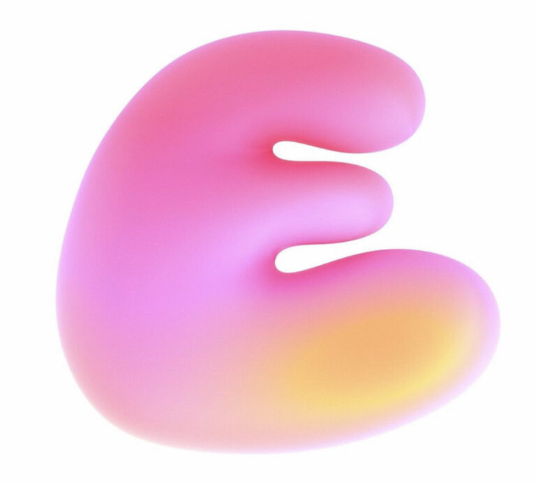
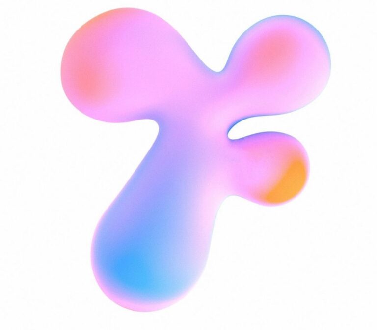
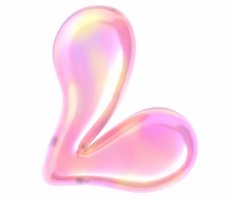
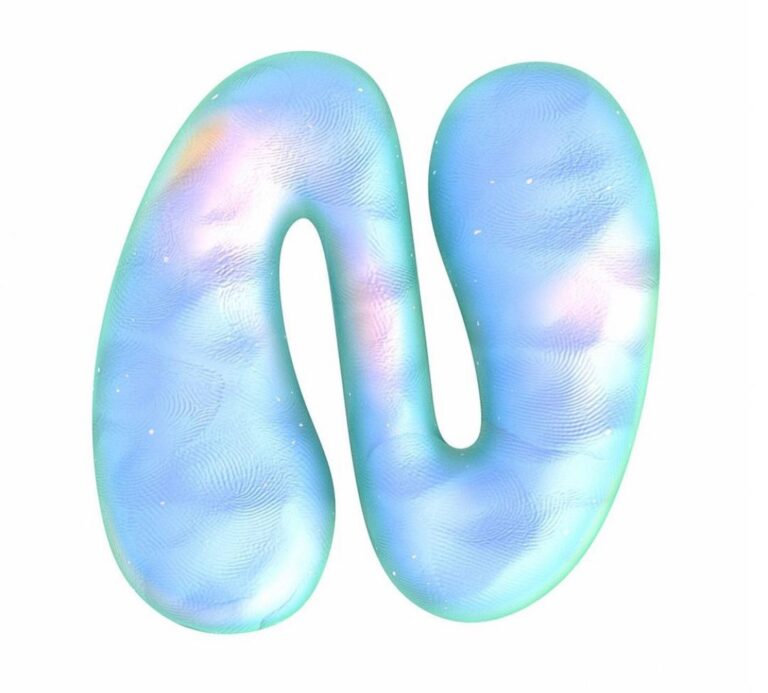
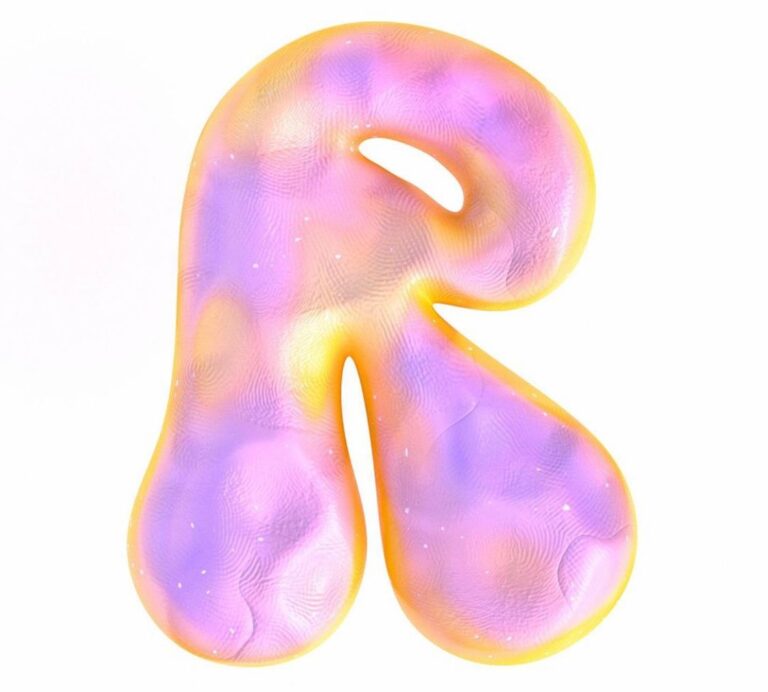
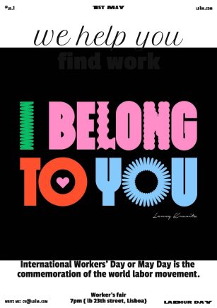
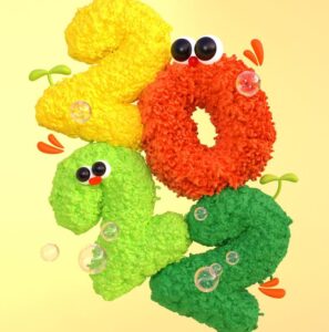
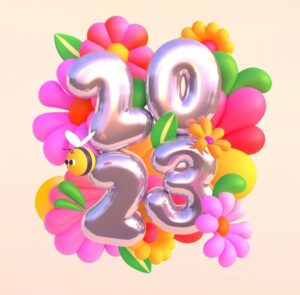
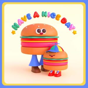
Typography is the art and technique of arranging type to make written language legible, readable and appealing when displayed. The arrangement of type involves selecting typefaces, point sizes, line lengths, line-spacing, and letter-spacing, as well as adjusting the space between pairs of letters. Some of my school projects have consisted in the realization of typography with different fonts , for the realization of which I kept a floral style, with vivid and bubbly colors.
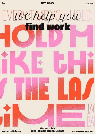
Grainy Geometric Typography
Grain texture is a great way to add energy, depth, and realism to your Adobe Illustrator designs. Meanwhile, “Geometric” is a genre (and sometimes historical) classification of typefaces—almost always sans serifs—so called because of their geometric construction: the circles, triangles, and straight lines that form the core shapes of their letterforms in typography.
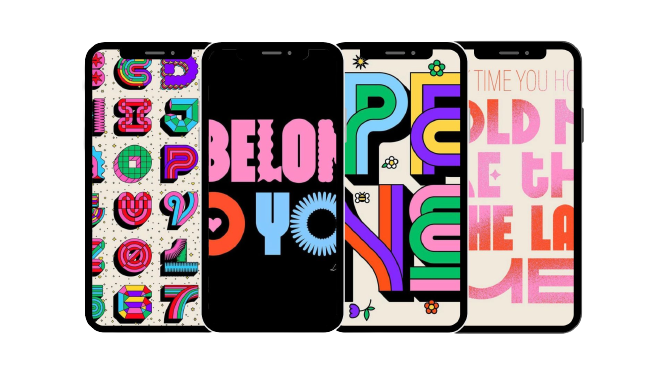
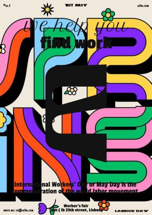
Vivid Colors
Vibrant colors enable enough of contrast helping to increase readability and legibility. Due to contrast layout elements become distinguishable and noticeable.
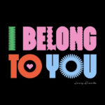
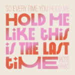
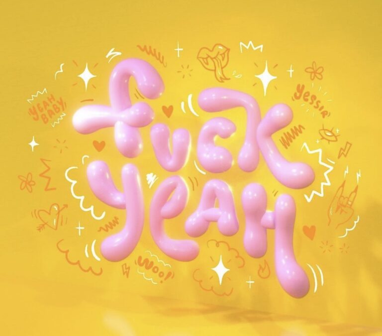
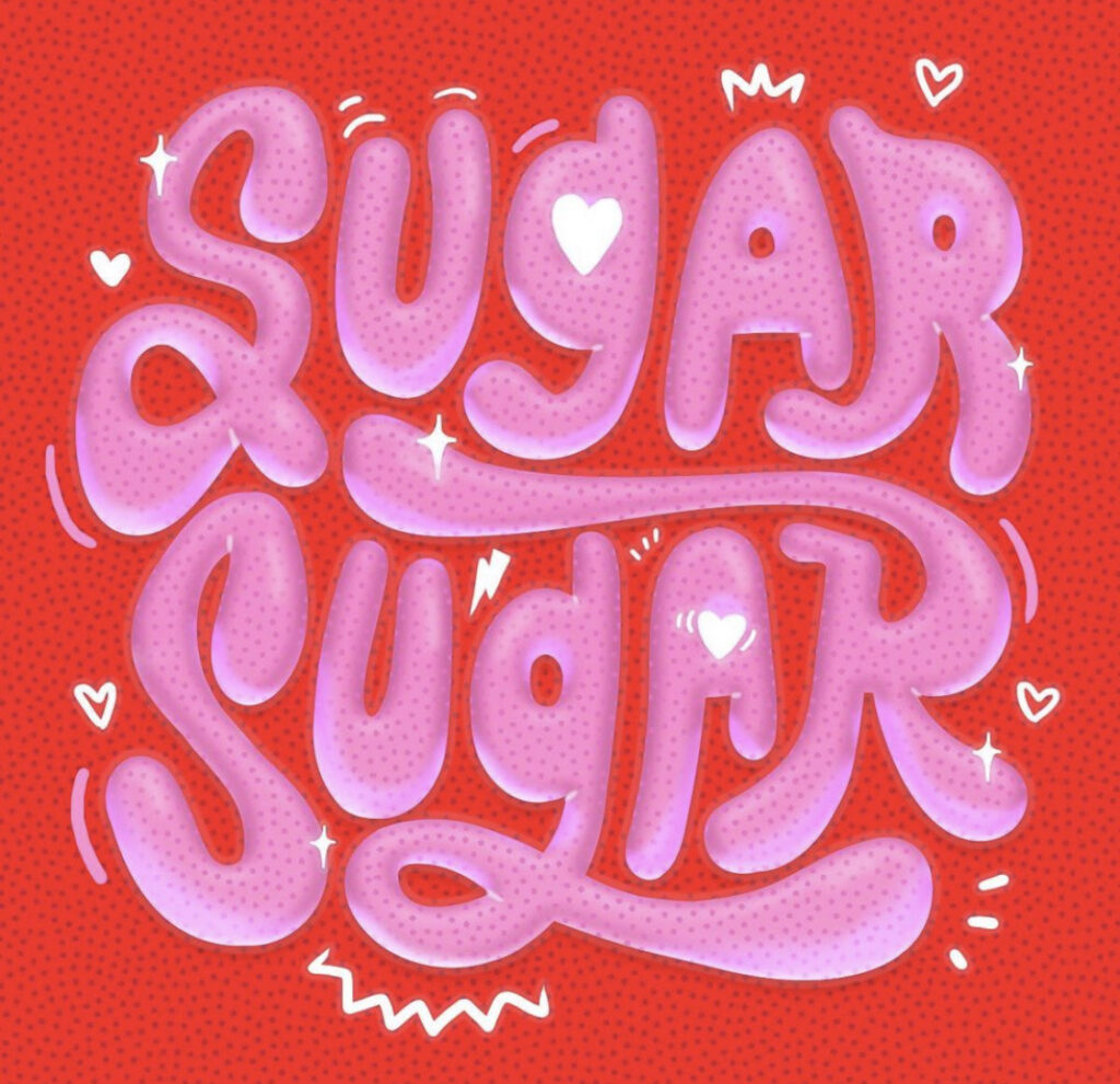
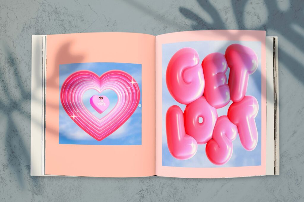
The typographies that I have used are inspired by, ©jasminazornic and their purpose was to serve as Magazine Cover.
For the creation of these fonts, I was based on tutorials and inspired by the artist ©cekpo.
I wanted to venture with the bubbly format to be more advanced and enrich my knowledge.
I am loyal to warm, pastel, but vivid tones. The completed works belong to everyday slang.
In these works, I also wanted to be able to make a contrast between the colors of the same family in order to deepen my sharpness as an artist.
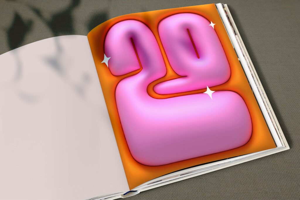

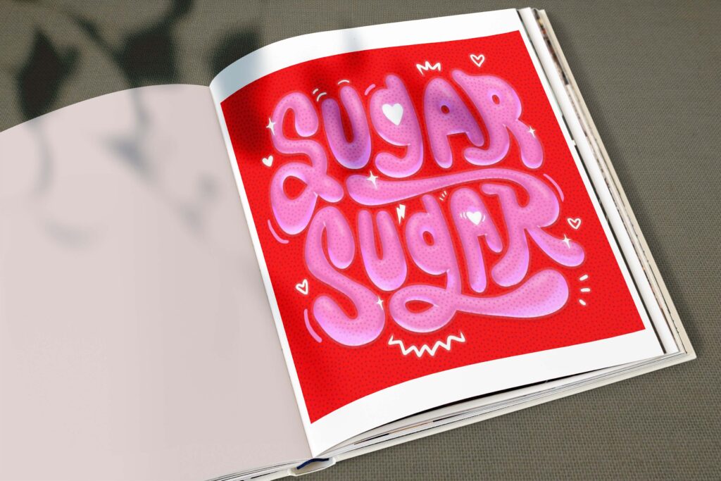
Bubbles for Magazine Cover
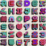
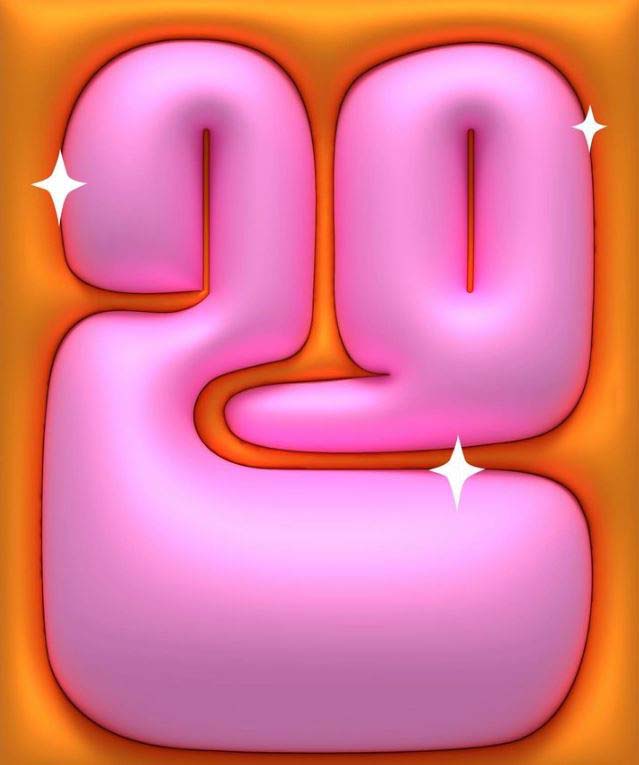
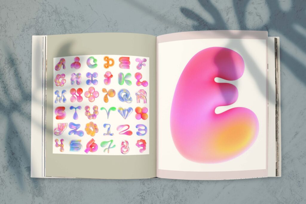
©MelissaKukineshi is my number one go to artist when it comes to graphic design or 3D animation. For this years 36daysoftypography these are some of my favorite letters.
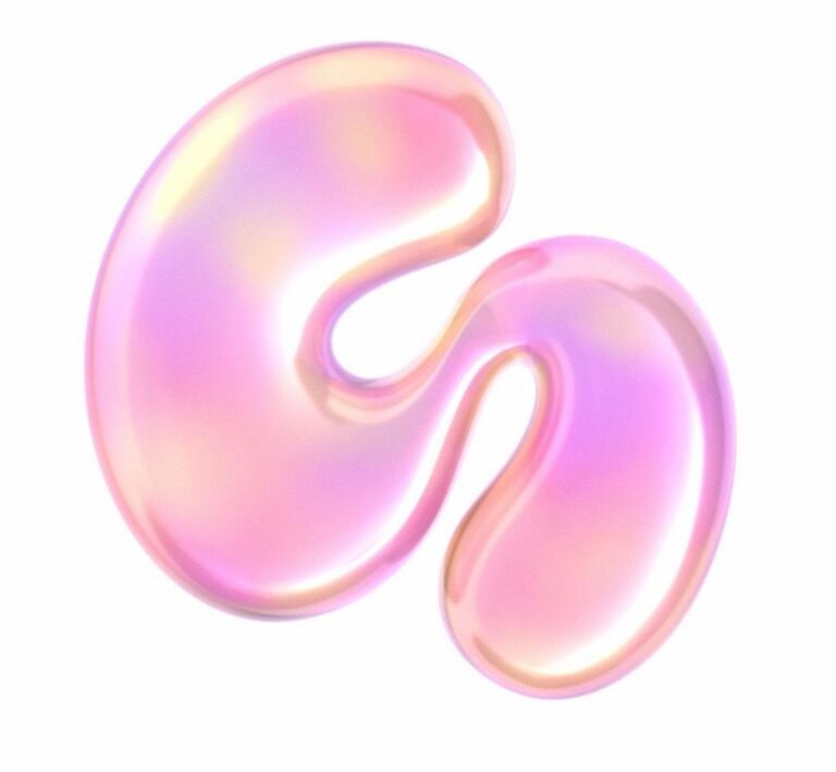
Cotton candy shade of pink to create a contrast between two illustrations.
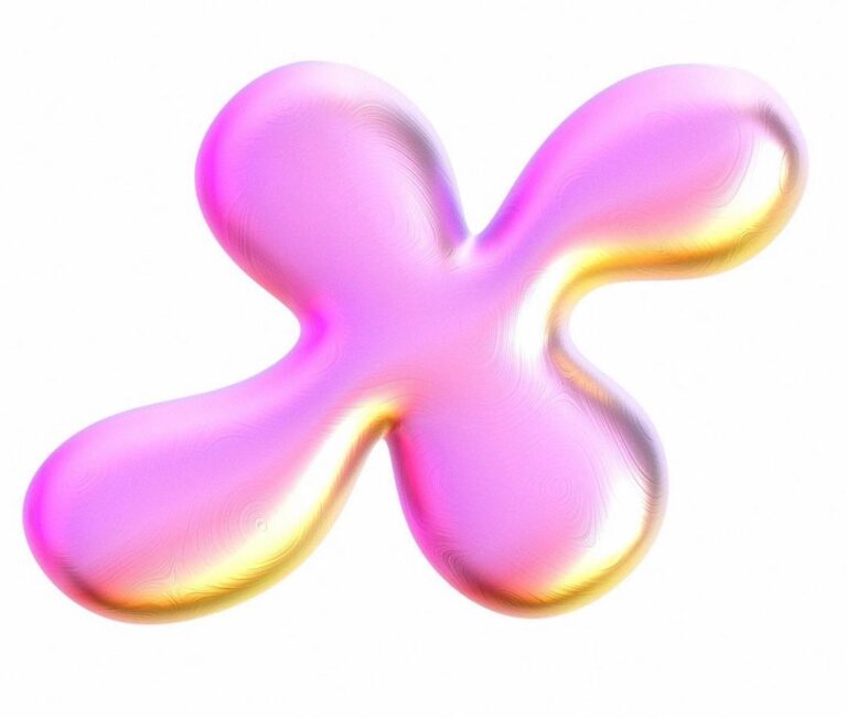
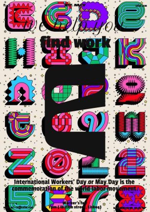
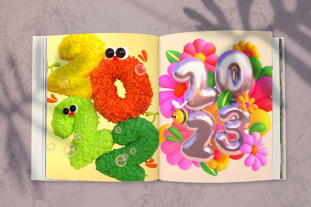
Vivid furry colors with Metallic Colorful Background to create a contrast between the backgrounds, but also to make a match within the diversity of the material.
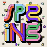
Pastel letters and numbers for the 36daysoftypography inspired by ©MelissaKukineshi.
Cotton Candy
Cotton candy is a light pink inspired by the classic color of the confection of the same name. As the name suggests, cotton candy has a fluffy appearance similar to raw cotton. Classic cotton candy is a spun sugar confection that has no ingredients other than sugar such that it is a cloudy white.
Bubbles for Magazine Cover
Metal fonts are typefaces with the vibe and look of real metals like gold, silver, iron, and aluminum. They are often shiny, bold, and have strong personalities. While mixed with some furry fonts ones that are warm and sweet, I wanted to test my progression in both style and skill.
Bubbles for Magazine Cover
A pastel is a soft, pale color. If your favorite shades are light blue and pale pink, you can say that you prefer pastels. Pastel is also an adjective describing a soft color, like a pastel shade of green or a pastel lavender dress. Pastel colors are my favorite palette and while testing the letters, pastels came out pretty strong with their soft colorful personality.
